移动网页页面小技巧包之meta
前段时间自己做了『点个赞社区』这个产品,所以接触到移动端的一些小技巧,现在总结如下
一 meta标签篇
移动端开发有很多问题要考虑,包括页面显示和一些特殊的因素,这里就引进我们的<meta>标签
<meta name="viewport" content="width=device-width,initial-scale=1,minimum-scale=1,maximum-scale=1,user-scalable=no" />
这条主要功能是设置视口宽度等于设备宽度,并禁止缩放。
<meta name="format-detection" content="telephone=no" />
这条禁止将页面中的数字识别为电话号码。
<meta>标签由name和content构成,name规定了这条<meta>标签的作用,content规定了视觉区域的参数,内容以『,』隔开
以下是name和对应的content的一些详细解释:
① viewport -- 视觉大小
width规定了视觉范围宽度,一般选择device-width即可以机器宽度作为宽度
initial-scale规定用户打开页面后的默认拉伸(同理还有maximum-scale和minimum-scale最大最小拉伸)
user-scalable=no规定了用户不能拉伸页面,我认为这是很重要的一条。因为很多浏览器为了包容没有响应式设计的老网站而自作聪明的在用户点击<input>时改变页面拉伸(这特么是最骚的),对于精心设计排版的移动网站完全是核打击
② keywords -- 关键字
<meta name="keywords" content="李大猫,可爱,技术">
告诉搜索引擎你的页面是干嘛的,方便浏览器收录
③ description -- 内容简述
<meta name="description" content="颠沛流离的诗人看到海">
添加description是为了在搜索引擎上表明这个页面的描述(类似副标题或者简述)
④ apple-mobile-web-app-capable -- Safari隐藏地址栏
这条小技巧只适用于ios上的safari,如果你的app想做成webapp的样子可以考虑这条效果
同时可以使用
<meta name="apple-mobile-web-app-status-bar-style" content="black" />
来定义显示手机信号、时间、电池的顶部导航栏的颜色。默认值为default(白色),可以定为black(黑色)和black-translucent(灰色半透明)。这个主要是根据实际的页面设计的主体色为搭配来进行设置。
ios7以前系统默认会对图标添加特效(圆角及高光),如果不希望系统添加特效,则可以用apple-touch-icon-precomposed.png代替apple-touch-icon.png
以下是针对ox不同设备,选择一个最优icon。默认iphone的大小为60px,ipad为76px,retina屏乘以2倍。
<link rel="apple-touch-icon" href="touch-icon-iphone.png">
<link rel="apple-touch-icon" sizes="76x76" href="touch-icon-ipad.png">
<link rel="apple-touch-icon" sizes="120x120" href="touch-icon-iphone-retina.png">
<link rel="apple-touch-icon" sizes="152x152" href="touch-icon-ipad-retina.png">
注:ios7不再为icon添加特效,ios7以前则默认为icon添加特效,除非icon有关键字-precomposed.png为后缀。
同样基于apple-mobile-web-app-capable设置为yes,还可以用WebApp设置一个类似NativeApp的启动画面。
<link rel="apple-touch-startup-image" href="/startup.png">
和apple-touch-icon不同,apple-mobile-web-app-capable不支持sizes属性,所以使用media来控制retina和横竖屏加载不同的启动画面。
// iPhone
<link href="apple-touch-startup-image-320x460.png" media="(device-width: 320px)" rel="apple-touch-startup-image" />

// iPhone Retina
<link href="apple-touch-startup-image-640x920.png" media="(device-width: 320px) and (-webkit-device-pixel-ratio: 2)" rel="apple-touch-startup-image" />
// iPhone 5
<link rel="apple-touch-startup-image" media="(device-width: 320px) and (device-height: 568px) and (-webkit-device-pixel-ratio: 2)" href="apple-touch-startup-image-640x1096.png">
// iPad portrait
<link href="apple-touch-startup-image-768x1004.png" media="(device-width: 768px) and (orientation: portrait)" rel="apple-touch-startup-image" />
// iPad landscape
<link href="apple-touch-startup-image-748x1024.png" media="(device-width: 768px) and (orientation: landscape)" rel="apple-touch-startup-image" />
// iPad Retina portrait
<link href="apple-touch-startup-image-1536x2008.png" media="(device-width: 1536px) and (orientation: portrait) and (-webkit-device-pixel-ratio: 2)" rel="apple-touch-startup-image" />
// iPad Retina landscape
<link href="apple-touch-startup-image-1496x2048.png"media="(device-width: 1536px)  and (orientation: landscape) and (-webkit-device-pixel-ratio: 2)"rel="apple-touch-startup-image" />
⑤ robots -- 搜索引擎爬虫的索引方式
用来告诉爬虫哪些页面需要索引,哪些页面不需要索引,例如
<meta name="robots" content="none">
具体参数如下:
- none : 搜索引擎将忽略此网页,等价于noindex,nofollow。
- noindex : 搜索引擎不索引此网页。
- nofollow: 搜索引擎不继续通过此网页的链接索引搜索其它的网页。
- all : 搜索引擎将索引此网页与继续通过此网页的链接索引,等价于index,follow。(默认是all)
- index : 搜索引擎索引此网页。
- follow : 搜索引擎继续通过此网页的链接索引搜索其它的网页。
⑥ format-detection -- 页面特定元素高亮处理
用来处理页面上特定元素的高亮
<meta name="format-detection" content="telephone=no" />
<meta name="format-detection" content="email=no" />
<meta name="format-detection" content="address=no" />
我们常用的微信自带浏览器上就会把页面上的一串数字自动高亮成蓝色,让整个页面美感很差,所以我们可以使用第一条禁用掉电话识别(同理下面两条为『邮件地址』和『跳转地图』(这个不太理解)
⑦ revisit-after -- 爬虫重访时间
<meta name="revisit-after" content="5 days" >
这里设置为5天防止爬虫给服务器造成特别大压力(反正这个blog更新很慢)
二 meta的http-equiv属性
此处主要参考了Lxxyx的blog
http-equiv顾名思义,相当于http的文件头作用。用来定义http参数等,正常的格式为:
<meta http-equiv="参数" content="具体的描述">
常用设置有如下用法
① X-UA-Compatible -- 浏览器采取何种版本渲染当前页面
<meta http-equiv="X-UA-Compatible" content="IE=edge,chrome=1"/> //指定IE和Chrome使用最新版本渲染当前页面
这里用于告知浏览器以何种版本来渲染页面(一般是最新版
② cache-control -- 指定请求和响应遵循的缓存机制
指导浏览器如何缓存某个响应以及缓存多长时间,图解如下
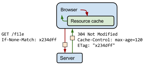
<meta http-equiv="cache-control" content="no-cache">
共有以下几种用法:
- no-cache: 先发送请求,与服务器确认该资源是否被更改,如果未被更改,则使用缓存。
- no-store: 不允许缓存,每次都要去服务器上,下载完整的响应。(安全措施)
- public : 缓存所有响应,但并非必须。因为max-age也可以做到相同效果
- private : 只为单个用户缓存,因此不允许任何中继进行缓存。(比如说CDN就不允许缓存private的响应)
- maxage : 表示当前请求开始,该响应在多久内能被缓存和重用,而不去服务器重新请求。例如:max-age=60表示响应可以再缓存和重用 60 秒。
如果为了防止被百度的MDZZ转码技术搞坏页面,还可以设置一条
<meta http-equiv="Cache-Control" content="no-siteapp" />
③ expires -- 网页到期时间
用于设定网页的到期时间,过期后网页必须到服务器上重新传输。举例:
<meta http-equiv="expires" content="Sunday 26 October 2017 01:00 GMT" />
④ refresh -- 自动刷新并指向某页面
这个这个功能非常常用,一般可以用来做页面统计,网页将在设定的时间内,自动刷新并调向设定的网址。举例:
<meta http-equiv="refresh" content="1;URL=http://pengfei.ga/"> //意思是1秒后跳转向首页